
How to make your WordPress page layout always use min the full site height and keeps the footer at the bottom.
TL;DR see the full code below (jump)
The problem – minimal content height
Note: I’m a developer and NOT a UI designer.
But one thing I really dislike about webdesign is, that when there is few text on the page, then the footer hangs directly below the content and the bottom of the page is empty space.
This is also the case with the the bundled themes from WordPress.
See a live example on WordPress playground here:
(for demonstration I used the older “Twenty-Twenty-Three” theme, since it has a smaller footer)
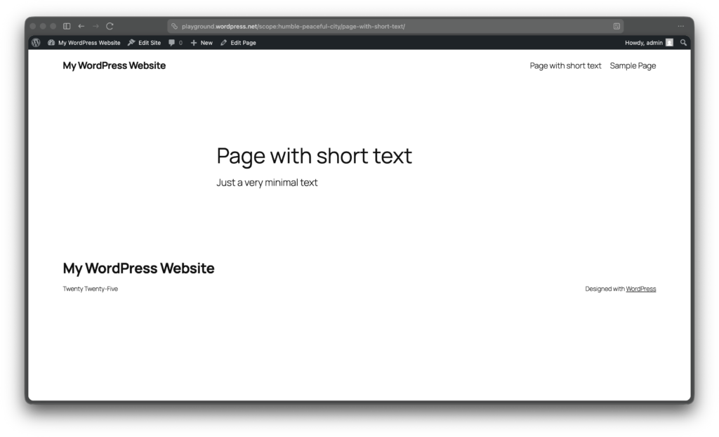
This is how HTML works. Normally only taking the height it needs for its content. So all elements are stacked at the top of the page, and the bottom of the site is empty.
The solution – full browser height
So what is the solution to this?
Short Answer: Making the page content at minimum the height of the browser height.
Thanks to CSS flexible box layout or short “Flexbox”, this is quite easily possible with just a few lines of code.
The main concept is to activate the flexbox layout with
display: flex;tell the page to be minimum the browser view height
min-height: 100vh;and then tell the page content to stretch and take the unused or remaining space
flex-grow: 1;Simple HTML full height example
With a minimal HTML page, the full code with inline CSS looks like this
<body style="display:flex; flex-direction:column; min-height:100vh;">
     <header>The simple header</header>
     <main style="flex-grow:1;">Small text content page</main>
     <footer>The simple footer</footer>
</body>
Here the <body> is set to minimum the full available height of the page and the <main> element takes up all remaining space. Therefor the <footer> is always at the bottom of the page.
Explanation of the CSS
display:flex;The element will be a flexbox containerflex-direction:column;Flexbox shows sub-elements as standard in one column (row mode). This tells the container to show its children vertically, each as its own columnmin-height:100vh;This sets the minimum height to 100% of the viewport. vw is a newer CSS unit (mdn)flex-grow:1; or shortflex:1;This element stretches to take the remaining space of the flex container
WordPress adaption for min full height
To adapt this solution to WordPress, I have based my solution on commonly used layout patterns and classes. If your Website uses different classes, you may have to adapt the code. But I’m sure you got this.
Content classes
I have based my CSS solution on the page layout with the latest bundled default theme Twenty-Twenty-Five.
Here two classes / args are being used:
- .wp-site-blocks
- main#wp–skip-link–target (on the main element)
We need two flex container, first the body and also the content wrapper.
Admin bar
If you are logged in to your WordPress website as default there is a small admin bar at the top of your page. To make the solution work also in that scenario, we have to substract the height of the admin-bar from the full height. Luckily this is very easily done with the built in CSS function calc().
The WordPress admin-bar has two height sizes:
- 32px – on Desktop or wide screen
- 46px – on Mobile or smaller screens (below 782px)
To solve this, the solution has a media-query that uses the different height for mobile screens. You can easily make this mobile-first by switching the lines and using min-width.
Full WordPress min full height CSS code
I created this code and also used it on this site. For example see it working on this page.
body {
  display: flex;
  flex-direction: column;
  min-height: 100vh;
}

body.admin-bar {
  min-height: calc(100vh - 32px);
}

@media screen and (max-width: 782px) {
  body.admin-bar {
    min-height: calc(100vh - 46px);
  }
}

.wp-site-blocks {
  display: flex;
  flex-direction: column;
  flex-grow: 1;
}

main#wp--skip-link--target {
  flex-grow: 1;
}
Comparison
As you can see in the pictures before (left) the footer was up on the page, directly after the page content. And after with the described solution (right), the footer stays on the bottom of the page.
Conclusion
That’s it. With just these few lines of CSS you can improve the layout of your (WordPress) page. So go make your site using the full height and get rid of the empty space.
Hope you find this small example code useful. Let me know in the comments if you use it on your site or what solutions you are using instead.
Credits
Featured image photo by Carriza Maiquez on Unsplash.
This post has been written by a human – me.
Leave a Reply